The online store: Expanding the brand into a modern baroque look
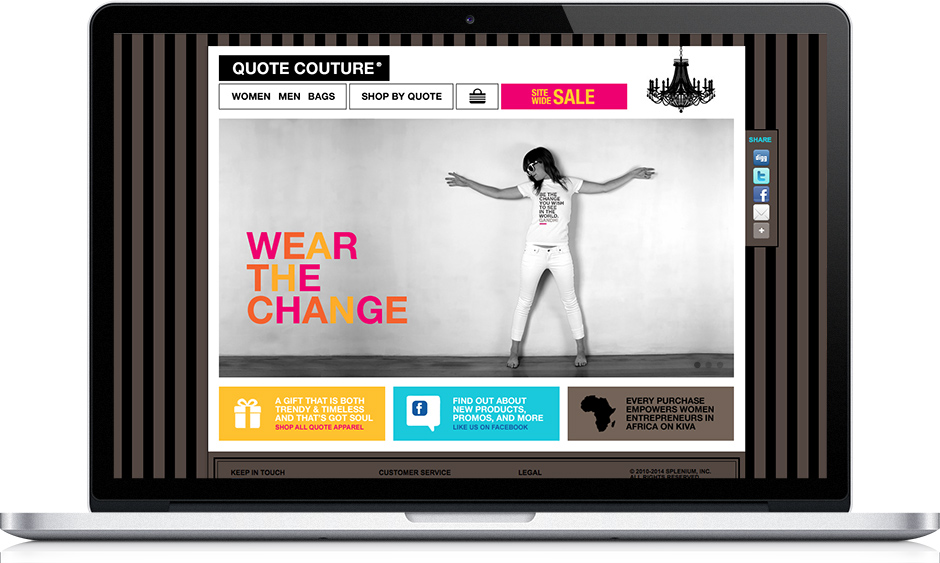
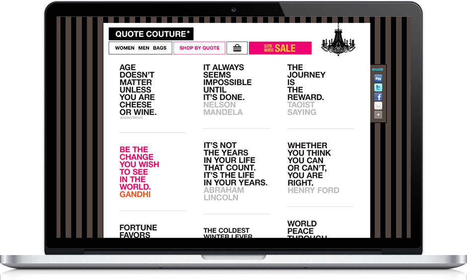
The online store was going to be the no.1 point of sale before expanding into other distribution channels. There, the brand started to take on more life and attributes. We expanded on the modern contemporary vibe by adding modern baroque elements: a beautiful chandelier in the top right of the website, a taupe & black striped background, and crown moldings in the footer, which also happen to be interior design elements that are reminiscent of being in a physical store. If there is a Quote Couture® physical store one day, you see where this is going. ;-)
Inspired by the rectangular shape of the logo, we used that shape as a visual container for the navbar elements, the main picture on the home page, and the “pods” underneath the pictures. Once we had those elements in place, it was time to add some bold splashes of color to add visual interest, and so we expanded the palette to bright yellows, turquoise, etc. but still maintained hot pink as the main bold color.
Creating a background that makes the brand even cooler
Note: We were going for a black & white background for the website initially but the stark contrast was too irritating and tiring to the eye, and kept pulling the focus away from the website so we had to tone down the focus on the background to a minimum while still implementing the look & feel of it as that was an important element. Imagine the website without it. The feel of the website might be very different then, definitely not as “cool”. And this striped background is not only present in the website, but in branded images, business cards, promotional content for Facebook, Twitter, etc.
Marketing goals hierarchy translates into visual hierarchy:
One big advantage of marketing-minded design™
Besides adding visual interest, bold splashes vs. monochromatic colors, stark vs. subtle contrast, big vs. small shapes, and more, are all used strategically to highlight and lowlight content on the website, so you can draw the eyes of your potential buyers to what’s most important first, what’s less important second, and what’s least important last. By doing that, you effectively direct the eyes of your users to exactly what you want them to look at, which should be aligned with what they came to do on your website. Hence, marketing-minded design™ is a win-win for all.
Additionally, you make sure that there are no competing elements to that visual hierarchy so their eyes and their minds do not get burned out trying to find what they are looking for amidst the visual clutter which will make them want to leave your website ASAP. This is likely one of the big factors in the high average drop rate on the 1st page around the net. Think of it as living in a house that is nicely organized vs. a house full of clutter. What would make you want to stay in that space longer? How much longer would it take you to find what you need in an organized space vs. a cluttered one? Well, it is essentially the same for a website.
Instead, you want to make it fast, easy, and hassle-free for your users to achieve what they came to do on your website, and visual hierarchy is a huge factor in that. To set up visual hierarchy, it’s important to be clear about your marketing goals, and their order of importance. If you need clarity or confirmation on this, not to worry, we can help. That marketing hierarchy is then translated into visual hierarchy. Hence, the term: marketing-minded design.
The shopping filter: Making it easy to shop
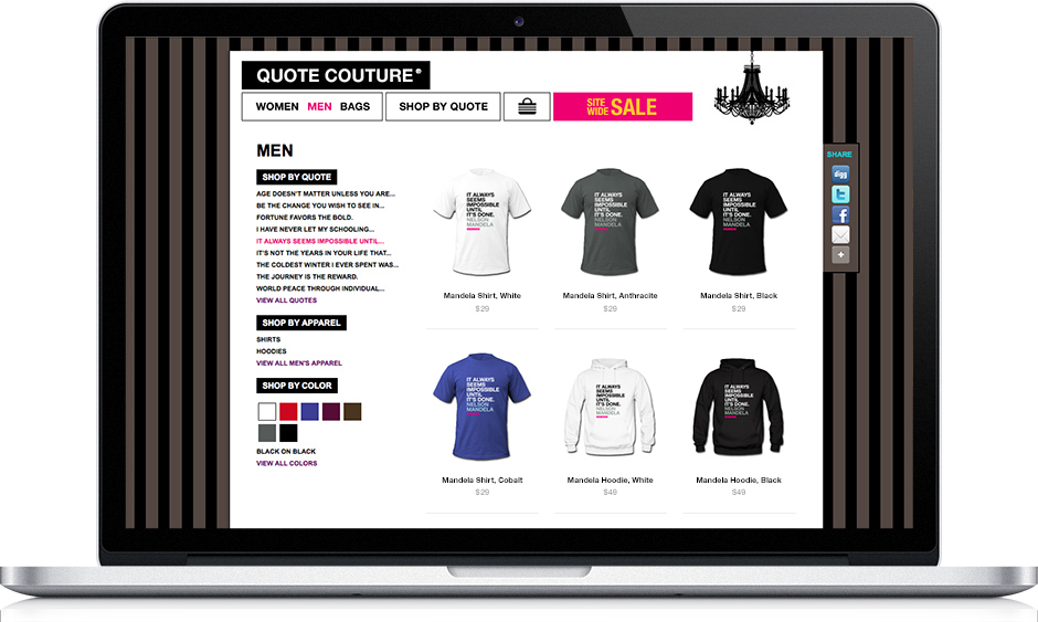
Potential buyers are able to filter the products by quote, by type of apparel, or by color. This allows them to get to the product they want to buy faster & easier, and they are able to see more products in less time, which increases the potential for a bigger order. This makes for a quick & easy fulfilling experience, which is likely to make them come back, and share the store with their friends.
Check out the rest of the Quote Couture® project:
The brand & products | The eCommerce mobile app

7x7 SAN FRANCISCO MAGAZINE
THE BEST OF THE CITY ISSUE


